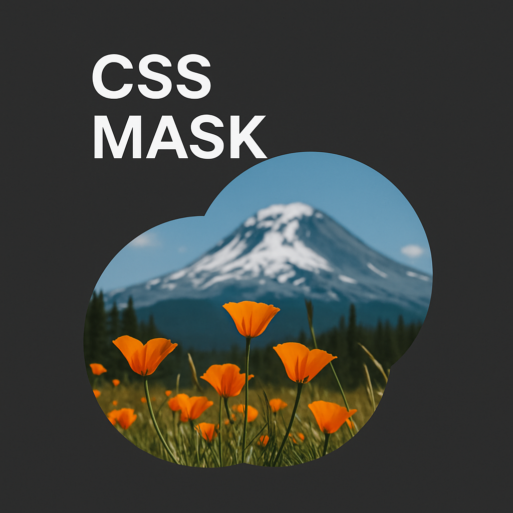
To mask a div with another div in CSS, the best approach is by using the mask-image property or clip-path. These CSS techniques allow you to control what part of a div is visible based on the shape or content of another div. This is particularly useful when you want to display content in an interesting shape without modifying the structure of the elements.
Here’s a direct and detailed way to mask a div with another div:
Step 1: HTML Structure
<div class="container">
  <div class="masked-content">
    This is the content to be masked.
  </div>
  <div class="mask-shape"></div>
</div>
Explanation:
.container: This is the wrapper that holds both themasked-contentand themask-shapeelements..masked-content: This is the content you want to apply the mask effect to..mask-shape: Thisdivwill act as the mask, defining the visible shape on themasked-content.
Step 2: CSS Styling
.container {
  position: relative;
  width: 300px;
  height: 200px;
}

.masked-content {
  width: 100%;
  height: 100%;
  background-color: lightblue;
  position: absolute;
  top: 0;
  left: 0;
  /* Applying mask image */
  mask-image: radial-gradient(circle, rgba(255, 255, 255, 0) 50%, rgba(0, 0, 0, 1) 100%);
  -webkit-mask-image: radial-gradient(circle, rgba(255, 255, 255, 0) 50%, rgba(0, 0, 0, 1) 100%);
}

.mask-shape {
  position: absolute;
  top: 0;
  left: 0;
  width: 100%;
  height: 100%;
  background-color: rgba(0, 0, 0, 0.5);
  /* Optional: You can also use an image as a mask */
  mask-image: url('path/to/mask-image.svg');
  -webkit-mask-image: url('path/to/mask-image.svg');
}
Detailed Explanation:
.container:- This
divacts as a wrapper for both themasked-contentandmask-shape. It is positioned relatively to allow absolute positioning of the child elements. - Set the desired width and height for the container that holds the content and the mask shape.
- This
.masked-content:- This
divholds the content to be masked. - The
position: absolute;ensures that it fills the entire container (.container). - The
mask-imageproperty is used to define the masking effect. Here, aradial-gradientis used, creating a circular mask where the center is transparent, and the outer edges are solid. This ensures that only the center of thedivcontent is visible.
- This
.mask-shape:- This
divprovides the shape or mask, which controls which part of the content will be visible. It is also positioned absolutely to fill the container. - You can use a semi-transparent background color or an image to create the mask. The
mask-imageproperty allows you to use an image, gradient, or any CSS shape.
- This
Advanced Masking Techniques:
Using an Image as a Mask:
You can replace the radial-gradient with an image file (SVG, PNG, etc.) to define the mask shape more precisely.
.mask-shape {
  mask-image: url('mask-shape.svg');
  -webkit-mask-image: url('mask-shape.svg');
}
Using clip-path for More Custom Shapes:
Alternatively, you can use clip-path to create complex shapes and apply them as a mask.
.masked-content {
  clip-path: circle(50% at 50% 50%); /* Example of a circular mask */
}
FAQ
1. Can I use this technique for multiple masks on the same div?
Yes, you can use multiple masks by stacking them. You would need to use mask-image with multiple images or gradient layers and separate them by commas. For more complex scenarios, you may need to adjust the positioning of each mask using mask-position.
2. What if the mask doesn’t work in older browsers?
If compatibility is a concern, consider using -webkit-mask-image for WebKit-based browsers (like Safari) and mask-image for other modern browsers. Always check browser compatibility for mask-related properties before implementing in production.
3. Can I animate a masked div?
Yes! You can animate the mask-image property using CSS animations or transitions. For instance, you can animate a gradient mask to change its position, size, or shape, creating dynamic effects.
4. How does clip-path compare to mask-image?
clip-path is simpler and typically used for creating visible shapes by clipping the content, whereas mask-image allows for more detailed control over transparency levels, making it more suitable for complex masking effects.
5. How can I control the area of the mask?
You can control the area of the mask using the mask-size, mask-position, and mask-repeat properties for image masks. For gradients, adjusting the gradient’s stops will help you modify the visible area.
Conclusion:
By using CSS properties like mask-image and clip-path, you can easily mask a div with another div to create visually dynamic effects. Whether you’re using gradients, images, or shapes, this technique allows you to control the visibility of content within a div, offering an elegant solution for web design without needing complex JavaScript.

