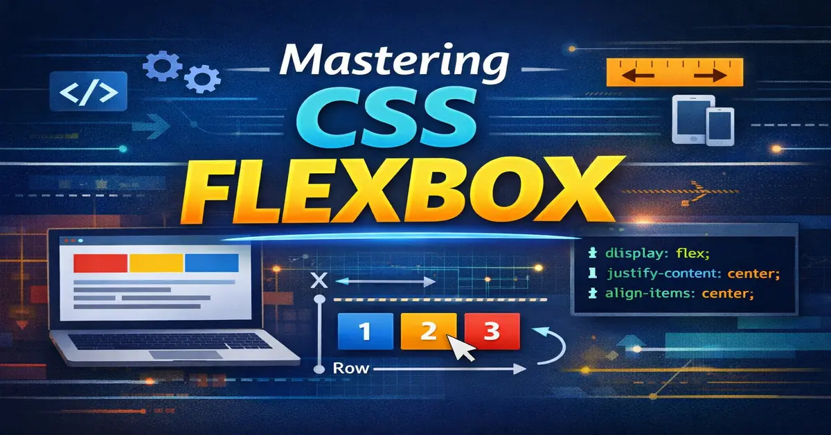
display: flex is one of the most used layout tools in modern CSS. It solves common alignment problems that were painful with floats and positioning. This guide explains Flexbox in a clean, practical way with tables and real usage patterns.
What is CSS Flexbox?
Flexbox (Flexible Box Layout) is a one‑dimensional layout system used to arrange elements in a row or a column.
If you’re new to CSS, read CSS basics first.
Flexbox works on two levels:
- Flex container (parent)
- Flex items (children)
.container {
  display: flex;
}
Why display: flex is Important
| Problem | Old CSS | Flexbox Solution |
|---|---|---|
| Vertical centering | Hacks | align-items: center |
| Equal height columns | JS | Built-in |
| Responsive layouts | Media queries | Auto flexible |
| Alignment control | Complex | Simple properties |
Flex Container Properties
These properties are applied on the parent element.
1. flex-direction
Defines the main axis direction.
| Value | Description |
|---|---|
row | Default, left → right |
row-reverse | Right → left |
column | Top → bottom |
column-reverse | Bottom → top |
.container {
  display: flex;
  flex-direction: row;
}
2. justify-content
Controls alignment along the main axis.
| Value | Use case |
|---|---|
flex-start | Default alignment |
center | Center items |
space-between | Navigation bars |
space-around | Even spacing |
space-evenly | Equal spacing |
.container {
  justify-content: space-between;
}
3. align-items
Controls alignment on the cross axis.
| Value | Result |
|---|---|
stretch | Default |
center | Vertical center |
flex-start | Top |
flex-end | Bottom |
.container {
  align-items: center;
}
4. flex-wrap
Controls whether items wrap to next line.
| Value | Behavior |
|---|---|
nowrap | Default |
wrap | Responsive wrapping |
wrap-reverse | Reverse wrapping |
.container {
  flex-wrap: wrap;
}
Flex Item Properties
These properties are applied to child elements.
1. flex-grow
Controls how much space an item should take.
| Value | Meaning |
|---|---|
0 | No grow |
1 | Equal share |
2+ | More space |
.item {
  flex-grow: 1;
}
2. flex-shrink
Controls shrinking when space is limited.
| Value | Behavior |
|---|---|
1 | Default |
0 | No shrink |
3. flex-basis
Defines the initial size of the item.
.item {
  flex-basis: 200px;
}
4. flex (Shorthand)
Most commonly used shorthand.
.item {
  flex: 1 1 200px;
}
| Part | Meaning |
|---|---|
| First | grow |
| Second | shrink |
| Third | basis |
Common Flexbox Layout Patterns
Center Everything
.container {
  display: flex;
  justify-content: center;
  align-items: center;
}
Responsive Card Layout
.cards {
  display: flex;
  flex-wrap: wrap;
  gap: 20px;
}

.card {
  flex: 1 1 300px;
}
Flexbox vs Grid (Quick Comparison)
| Feature | Flexbox | Grid |
|---|---|---|
| Dimension | One | Two |
| Use case | Components | Page layout |
| Direction | Row/Column | Rows + Columns |
If you want to explore layout systems deeply, check CSS Grid vs Flexbox for a clear comparison.
Performance & Optimization Tips
| Tip | Reason |
|---|---|
| Avoid deep nesting | Layout recalculation |
Use gap instead of margin | Cleaner & faster |
| Prefer Flexbox for components | Predictable behavior |
| Avoid fixed widths | Better responsiveness |
When NOT to Use Flexbox
| Scenario | Better Choice |
|---|---|
| Full page layout | CSS Grid |
| Overlapping items | Positioning |
| Complex 2D layout | Grid |
Final Notes
display: flex is stable, fast, and supported by all modern browsers. For UI components, navigation bars, cards, and alignment tasks, Flexbox remains the default choice.
If you understand Flexbox well, most layout issues disappear.