If you’ve ever wondered why content inside a box doesn’t stick to its border, the answer is CSS padding. Padding is one of the most basic yet most important concepts in CSS, and it plays a huge role in layout, readability, and overall UI design.
In this article, I’ll explain what padding in CSS is, how it works, real-world examples, and common mistakes developers make — all in a simple, practical tone.

What Is Padding in CSS?
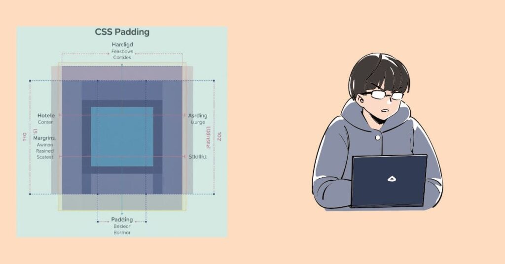
Padding in CSS is the space between an element’s content and its border.
In simple words:
- Padding creates inner spacing
- It pushes content away from the border
- It makes designs look clean and readable
div {
  padding: 20px;
}
This means the content inside the div will stay 20px away from all sides of the border.
Padding vs Margin (Quick Difference)
Many beginners confuse padding with margin, so let’s clear it fast:
| Property | Space Applied To |
|---|---|
| Padding | Inside the element |
| Margin | Outside the element |
👉 Padding affects the inside, margin affects the outside.
Why Padding Is Important in Web Design
Padding is not optional — it’s essential.
Without padding:
- Text touches borders 😖
- Buttons look cramped
- UI feels cheap and unreadable
With proper padding:
- Content breathes
- Buttons feel clickable
- Layout looks professional
Almost every good UI uses padding correctly.
CSS Padding Properties
CSS gives you full control over padding using these properties:
1. Padding All Sides
.box {
  padding: 16px;
}
Applies padding to top, right, bottom, and left.
2. Padding Individual Sides
.box {
  padding-top: 10px;
  padding-right: 15px;
  padding-bottom: 10px;
  padding-left: 15px;
}
Useful when you need different spacing on each side.
3. Padding Shorthand
.box {
  padding: 10px 20px;
}
Meaning:
- Top & Bottom →
10px - Left & Right →
20px
Another example:
.box {
  padding: 10px 15px 20px 25px;
}
Order:
Top → Right → Bottom → Left (clockwise)
Padding and the CSS Box Model
Padding is a core part of the CSS Box Model:
Content → Padding → Border → Margin
Padding increases the total size of an element unless you use box-sizing.
* {
  box-sizing: border-box;
}
This makes layouts easier and more predictable.
Padding with Width and Height
Important rule:
Padding adds extra space to width and height by default.
Example:
.box {
  width: 200px;
  padding: 20px;
}
Actual width becomes 240px.
To avoid this:
.box {
  box-sizing: border-box;
}
Now the width stays 200px, including padding.
Padding in Buttons (Real Example)
button {
  padding: 12px 24px;
  border: none;
  background: #2563eb;
  color: white;
}
This is why buttons feel comfortable to click — padding creates the space.
Can Padding Be Negative?
❌ No.
Padding cannot be negative. If you need negative space, that’s a margin job.
Padding Units You Can Use
Padding supports all common CSS units:
px%emremvw / vh
Example:
.card {
  padding: 1.5rem;
}
rem is preferred for responsive and accessible designs.
Common Padding Mistakes
Avoid these beginner mistakes:
❌ Using margin instead of padding inside components
❌ Forgetting box-sizing: border-box
❌ Over-padding causing layout breaks
❌ Inconsistent padding across components
Best Practices for Using Padding
✔ Use consistent spacing (8px, 16px, 24px system)
✔ Prefer rem over px
✔ Use padding for internal spacing only
✔ Combine with flexbox/grid for better layouts
Browser Support
Padding is supported in all modern browsers, including:
- Chrome
- Firefox
- Safari
- Edge
No compatibility issues.
Learn More (External Resources)
- MDN CSS Padding Documentation: https://developer.mozilla.org/en-US/docs/Web/CSS/padding
- CSS Box Model Guide: https://developer.mozilla.org/en-US/docs/Learn/CSS/Building_blocks/The_box_model
- W3Schools Padding Tutorial: https://www.w3schools.com/css/css_padding.asp
Final Thoughts
Padding may look small, but it has a huge impact on UI quality. If your design feels off, cramped, or unreadable — chances are padding is missing or misused.
Master padding, and your CSS layouts will instantly look cleaner and more professional.
If you’re learning CSS step by step, this is one concept you should never skip.
Tailwind CSS with Vite: A Modern Front-End Setup Guide
Scrollbar in CSS: How Modern Websites Customize Scroll Experience
Responsive Web App Tips Using Tailwind CSS


